How to Pick Your Color Palette
When it comes to picking the fabrics for a new quilt, I love going to my fabric stash and optioning different colors palettes. Most of it is intuition and my current mood, but I do have some techniques for finding the perfect colors that will work well together in a project.
This information is important for quilt makers, but understanding the techniques for picking a color palette is useful for fashion design, fine art, filmmaking, interior design and many other mediums.
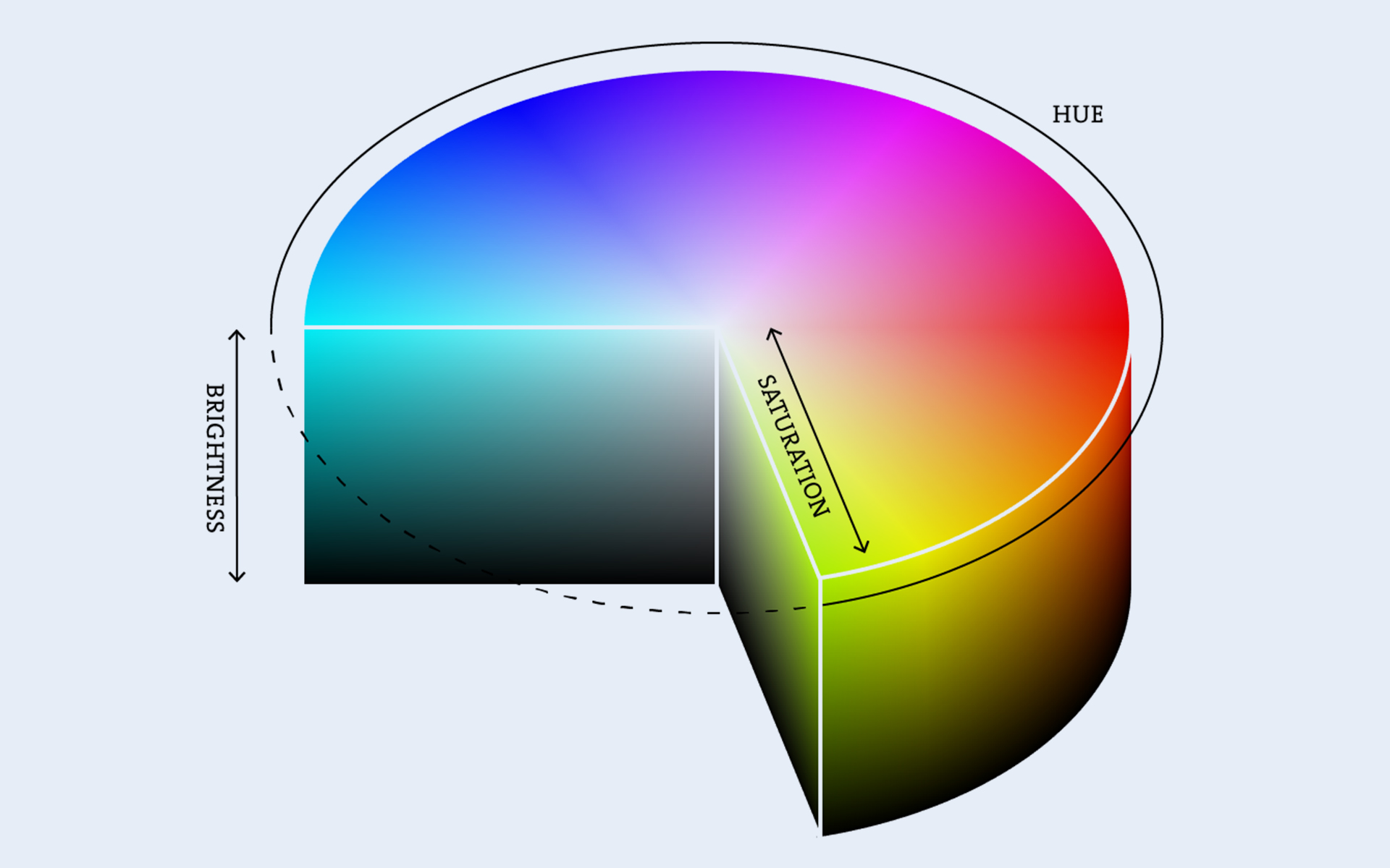
Colors can be divided into hue, brightness and saturation.
Hue is the actual color perceived, and more scientifically, the specific wavelength of light that is bouncing off the object and being perceived by your eye. So, if you say that something is more orange than yellow, that would be its hue.
Brightness, or sometimes referred to as value, is a degree of how light or dark the color is. So, red in dark shades could appear as maroon and in lighter tints could appear pink. Brightness also represents the amplitude of the wavelength.
Saturation is how vivid or intense a color is in relation to pure grey. For example, sage green represents a low saturation of green as it has a lot of grey in it. Kelly green, however, is a green that is at almost 100% saturation.
So here are my 3 techniques for deciding your hue, brightness and saturation for the colors in your quilt.
For Hue, Use the Color Wheel
If you know anything about color theory (or if you ever took an art class in grade school), you probably know about the color wheel. Basically, the color wheel is a circular diagram that illustrates the different relationships between colors. While there are varying versions, most color wheels consist of the three primary colors (red, yellow and blue), the three secondary colors in between them (orange, green and purple), and all of the tertiary colors (when you mix primary and a secondary colors together).
Colors that are opposite on the wheel are called complementary. An example would be orange and blue, which is often used in cinema to create striking contrasts. On the other hand, colors that are close together on the color wheel are called analogous. An example of this would be blue, cyan and green, which is considered a “harmonious” combination. Finally, the color temperature is also an important consideration when picking colors from the color wheel. Most artists divide the color wheel into warm colors and cool colors.
Often times, I use both complementary and analogous to help me find my color palette. For example I may pick a orange and blue, but I include red-orange and yellow-orange colors in palette, so oranges are my analogous colors and the blue pops in contrast.

For Brightness, Think in Black and White
I find this trick to be really helpful when determining the brightness of my color palette for a quilt. Usually, I want to have a range of lights and darks throughout the quilt to make it feel balanced. However, sometimes it is hard to perceive the brightness of a color because variations in saturation make things appear lighter or darker than they really are. A great technique to overcome this is to take a picture of your fabric pull and desaturate the image so it is only in black and white. Then, suddenly, the brightness of the colors becomes obvious.


For Saturation, Use the Context and Your Intuition
Saturation is much more about the feeling of the piece: many standard color palettes use adjectives like pastel, jewel-tones, bold or subtle to describe the overall feeling that is conveyed through saturation. Also it is important to think of the context of the project. It is rare for me to use overly saturated colors on a bed quilt because I don’t believe that bold colors are conducive to rest and sleep. Conversely, I often choose vibrant colors for a throw quilt because it is more of a statement piece for the living room, which is inherently livelier.
My personal aesthetic typically involves degrees in saturation similar to brightness, as I think that incorporating both bold and subtle colors helps to balance the quilt. Here is an example of a primary color pull, which can be all the same saturation (in this case bold) or varying degrees of saturation (my intuitive choice). Which one do you like more?

